Diwatang Maria Product Branding
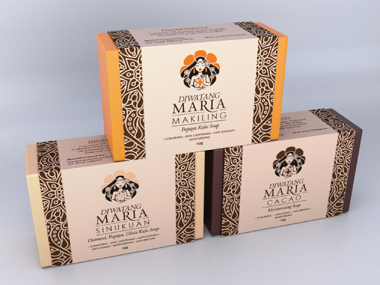
The concept behind the design is to show a Diwata as a Goddess who is giving her gift to mankind, hence the shining star she's holding on her chest. the colored parts of the logo will vary depending on the product representing, so they are assigned based on the actual soap -- Makiling is Orange, Sinukuan would be white while Cacao's would be Brown. this will also give the Diwata character the versatility of representing all three Major Diwatas even if it is only using the same illustration. very much like how the Diwatas have similar attributes -- a beautiful woman w/ long black hair.