Perry Referrals Logo, Brand Identity & Stationery Design
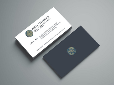
Now we have the logo design all nailed down I can focus on creating the rest of deliverables that will make-up the overall brand identity.
First up is some layout exploration for the stationery, so looking at overall: layout, grids, typography, and utilising colours etc.
Keeping the whole look as clean as possible, so using the dark petrol blue as a nice contrast against what will be pure white paper stock etc, which includes the overall impression of cleanliness and hygiene for a veterinary specialist
Also keeping in mind the various possible print finishes, like: type of paper/card stock, gold foil, spot uv and embossing, all quite possible with this particular logo design.
I'm thinking gold foil for the, ermmm, gold bits, with a possible emboss of the surrounding container, which will need a double helping of card glued together, so the emboss doesn't show through on the contact side.


