Leak Detection Sensor Promo Website Design for Flume, Inc.
Hi guys!
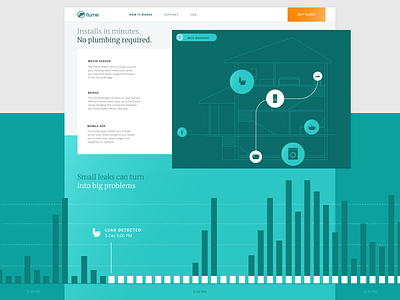
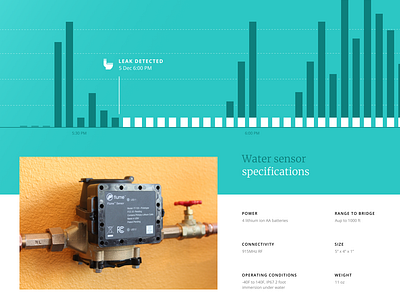
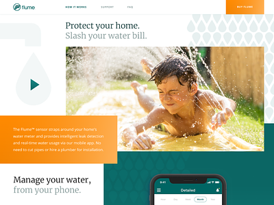
We’ve got something big to share with you today! That’s a website we’ve made here at Zajno for a sick company called Flume, Inc. to help them promote their product, an intelligent leak detection sensor. The sensor allows saving water and money providing intelligent leak detection and water management via their mobile app. The product doesn’t only help saving money, but also provides a solution to the environmental problem of fresh water shortage. Everybody saw that episode of Explained about the world’s water crisis, right? (really recommend to watch it if you didn’t, here. Knowing that we were working on a thing that can make this world a better place was a brilliant source of inspiration and motivation. Now, I’m happy to announce that the website is live and we can finally show it to you! :) Check it out here: https://flumetech.com/
Goals Day Zero is coming, the world is about to face its gravest water crisis, so it’s about time to start saving water. Flume, Inc. offers a solution: a sensor and software that detect and identify abnormal water usage. The mission of the company is saving both water on the planet and their customers’ money by reducing their water bills, so our task was to create a top-notch website to efficiently communicate the message in an easy to understand and engaging way.
Approach One of the requirements to the design was that it shouldn’t be too corporate, but instead should evoke an emotion, so people can relate and better understand the message, which is ultimately expected to increase their trust for the product being offered. To that end we told stories and showcased the problems the product helps solve, both educating people on the matter as well as having an emotional impact thanks to utilizing relevant imagery. In terms of design we were aiming for something aesthetically clean, smooth, free flowing and functional, and at the same time interesting and fresh. Experimenting with the layout in order to come up with an unconventional solution, we paid great attention to smart whitespace utilization to help users focus on what’s important. Аll the animations we used help get the point across to the end user, adding more life to the overall feel of the website.
Results We helped Flume, Inc. present their product as a solution to environmental and financial problems, explaining how the sensor can help resolve them. The website we ended up with is visually rich, lively and emotional, it showcases the product’s main features and benefits in a user-friendly efficient way. Not to mention, the development was done by our development team who did a great job of optimizing the performance.
Let me know what you think of it! Eager to hear form you!
Press "L" to show some love!
ᗈ Join our Newsletter! ᗈ Website ᗈ TheGrid ᗈ Spotify ᗈ Twitter ᗈ Medium ᗈ Facebook ᗈ Instagram


