Rock
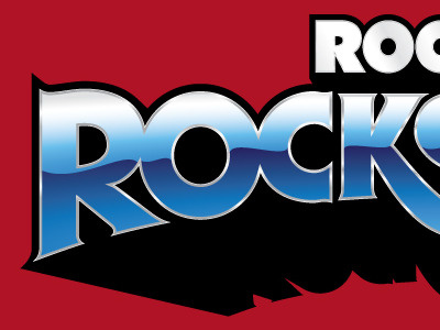
This is a one color logo at it's stripped base, then there are layers of dimensionality that I added, so this can go from 1-color faxing to full color printing in the click of a few layers. Everything was done by hand rather than using filters. I think the lettering looks much nicer when it hasn't been pulled and stretched out like pizza dough. Base font was Serif Gothic. What font is more Rock-n-Roll than Serif Gothic, right?! All of the letters were redrawn to bring a little more modernity to the logo and do some fun stuff with the baseline curve. It's still got that classic sense of history with the fun swashes and ligatures that was so common for typesetters in the 60s - 70s.
More by Alex Sheldon View profile
Like
