Park 'n' Go Redesign
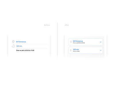
This is a before and after shot of the most important part of the app. Selection fields don’t have to be boring! Be sure to check out the full case study in the link below to see more details!
👉 Full case study (It's worth it! 🔥)
Don't forget to leave a like (press “L”) ❤️.
We would like to hear your feedback as well 💬.