Wooden Hill Brand Identity
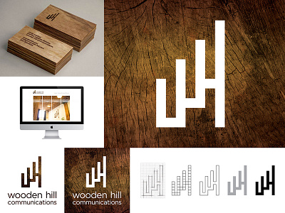
This brand identity was created for the advertising & marketing agency Wooden Hill Communications. The name itself is derived from an English term for stairs. They adopted this name based on their belief that brands should be built one step at a time.
The logo is comprised of a merged "W" and "H" to create the shape of an ascending staircase, intended to reflect the agency's step-by-step approach to the creative process.
The wooden texture and colour palette reflect notions of warm and down-to-earth ideals, reflective of Wooden Hill's brand personality.
The staircase effect is revealed in a variety of ways, both two and three dimensional. The standard upright position creates a two-dimensional ascending staircase with a railing. When concentrating on the negative space, a three dimensional birds-eye view of the staircase is revealed. Turned clockwise, the negative space takes on an entirely new three quarter view.
The proposed design for wooden business cards utilizes a burned-in effect. This design is simple and unique to the brand, utilizing the wooden texture form the logo, and printed on real pieces of wood.
See more of this project here:
https://www.katrinapacheco.ca/#/wooden-hill-brand-identity/
