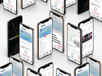
NYC METROCARD SYSTEM: UI/UX CASE STUDY
Excerpt from my medium publication
"The NYC metrocard system has remained unchanged for decades. The cost of the metrocard machine infrastructure, the lost time of waiting in line to buy a metrocard, touching a dirty machine to do it, the potential of losing the metrocard, and the ease of gaming the system by swiping your card for others has cost the city millions of dollars and leaves much to be desired from the user experience.
Design a new system that allows a daily user who uses the metro daily or an-out-of-town visitor who will use the metro just once to get access to the metro, on time, without having a physical NYC metrocard on hand."
Also link to my medium publication to continue reading;
https://medium.com/@emmaron78/nyc-metrocard-system-ui-ux-case-study-e1d0f6dff8
