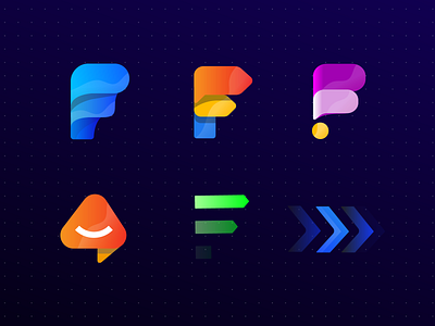
Feedture - Logo design process & proposals
Hey guys! 👋 I'm really excited to share with you guys whole logo process and proposals. Check all details regarding proposals bellow ⬇
What do you think? Which one for you looks the best?
Meaning of the name:
Future + Feedback = Feedture
Something about the project:
Featured is an app that assists product owners to engage with their customers directly to gain feedback and collate feature requests. This allows for effective growth and development of key features - around user wants, and not what product owners think they want.
Emotions that we want to evoke:
Happy
Engaging
Casual
Modern
Future
Logo proposals with the meaning process:
Logo 1 - F symbol - very simple modern - first element is feedback /chat/comment box, second element have a repeatable moment which is very good for communication and feedback and future - colours: fresh blue - Engaging colour
Logo 2: F symbol again - feedback + future F is main symbol here - first element chat again, second Road sign which represents movement moment on all startups or companies, also we have future in those colours
Logo 3: 2 chat box elements - F symbol and dot - combination everything is an exclamation mark
Logo 4 - arrow for top - a triangle that goes up - chat symbol - feedback symbol - smile for the Happy moment
Logo 5 - fresh green colour - F symbol, 2 arrows for future movement - fade is from down to top which represents steps - stairways to future
Logo 6 - something similar like the sign on a motorway - this logo is perfect for digital animation! also have blue colour - future movement symbol, etc ..
Also, don't forget to check the attachment files with the sketch and video
Looking forward to your feedback!
Check my behance portfolio here
All the best! Cheers!


