Park 'n' Go Redesign
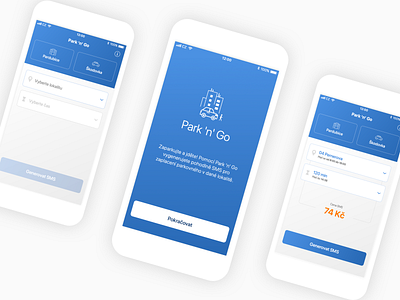
Simple, intuitive, and clean. That’s what we wanted from the redesign. Subtle blue gradient gives the screens a needed depth. Be sure to check out the full case study in the link below to see more details!
👉 Full case study (It's worth it! 🔥)
Don't forget to leave a like (press “L”) ❤️. We would like to hear your feedback as well 💬.