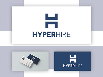
Job opportunities agency logo design
The shape is two H letters as the two words start with the same letter. The bottom one also is a desk that stands for work and jobs as the company connects jobs opportunities with unemployed people.
The name HYPER is bold and more visible to make it speak for itself. The other (Hire) is thin to make it look separated from the other word ...
More by Med View profile
Like


