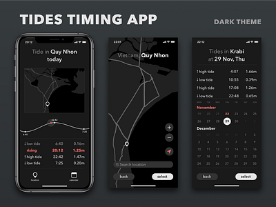
Tides timing app concept. Dark theme.
Slightly reworked and simplified dark theme of my Tides timing app concept. I would be grateful for the comments regarding accessibility in this concept. I believe reachability is good (everything is reachable by a thumb holding an iPhone), but not sure if contrast is enough.
I welcome all your comments, suggestions and, of course, likes (:
More by Dima Veremchuk View profile
Like
