Breadcrumbs
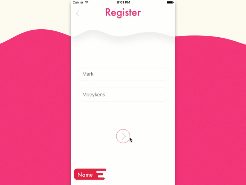
Here's a mobile prototype I created in Xcode (iOS development tool). The idea is it shows progression during a registration process but the images are also buttons that can be used to navigate backwards.
Now although I think this looks cool, if I were to audit myself I would point out some potential problems.
One
Tint Color. Normally in iOS apps all interactive elements use the same tint color to indicate to the user "you can tap me". The buttons I show at the bottom are different colors.
Two
The title, "Register", is also similar to the tint color and could be confused as an element the user can tap or interact with.
Three
The user doesn't have a sense of how many steps there will be. In iOS this is usually solved by using a "paging indicator" which are the little dots you usually see at the bottom of the screen. We might be able to solve this if we (and when I say "we", I mean "I") create outlines of the puzzle pieces or maybe even faded placeholders.
What do you guys think? Any other suggestions for improvement?
(Sorry for the repost. The first gif seems slow. So I re-rendered it from 60 frames to 30 frames per second and now it seems like the correct speed.)
Xcode Project: https://www.patreon.com/posts/breadcrumbs-23361540
