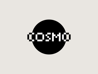
3rd logo for COSMO
Third proposal for cosmo.
The use of black and white takes up the minimal style of music. In the logo, the cosmos name is transformed into the ring of the planet, which takes shape thanks to the positive / negative optical effect of the name.
_____
www.antoniocalvino.com
Social Links:
Facebook | Instagram | Behance | Ello | Twitter | Linkedin | Pinterest
More by Antonio Calvino View profile
Like

