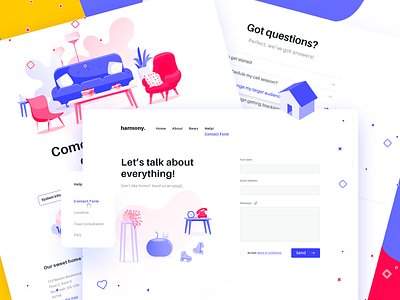
Contact & Help Pages
Wohooo, Friday is here!
Hi there,
(heads up & sorry for the long post 🥔)
Exploring additional screens for the Harmony project, Help Page & Contact. Changed a few things based on the feedback I received 😀, hope it's more balanced now (still feel like I went a little overboard). View attachment for the full page.
Will attach all updated screens together with my upcoming upload of this project - stay tuned if you please 🤷.
In addition, I would like to go a step back to the very grounds of this design (read the full story in the original post) and, explain how it works.
First of all, the concept is “dynamic & selective content”, which means that the main purpose is to offer quick and smart interaction for targeted users (85% of them). Secondly, to find out more about the random landing users (the rest - 15%), and how could we attract them too. And finally, weird is our last, increase customer value & revenue. We thought that we would have better chances of achieving the last one, by giving everything to our potential clients, through an awesome online experience.
How it works: when accessing the website for the first time the visitors get a welcome pop-up message to select or add their interest. For the ones who select one of the two choices, they get selective content - meaning everything is dedicated to their interest only, and anything else is dropped into the web abyss. However, If the visitors are part of the other category and add their interest, we learn more about them, and they get the full available content so that we can check out our heatmaps and know what to offer them next time.
Getting back to the Contact form. In order to fasten our user's experience, even if with a click, we didn’t add the classic "Your reason" category drop down because it has already been split in three: advertising team, publishing team, and general support team - so the messages are already set by default to reach the proper support team, after the first step from entering the website.
So, in the end, when we're contacted through the Contact Form, everything is assigned to designated teams, and so we get back to them quicker, get more clients, and, yay, become more productive. Sure, there are some questions about how well this works, what if that %15 of random users grows, what if the %15 then splits in another two categories etc, but the scope here is to focus on the 85% and figure out the rest by researching, testing and improving.
Thanks for stopping by.
Related screens:
Welcome Page
Home Page
--
Constructive feedback is always highly appreciated, that's why we're here!
If you like it, 'L'ike it 😊
Happy Weekend ❤️ (11 Days til 🎅 Xmas omgomgomg)
--
We are available for projects
Estimate your project at teamuinugget@gmail.com
More projects on Behance
Follow us on Instagram | Facebook
--
*With this opportunity I’d like to give a big thanks to Freepik and Flaticon and all their contributors, for providing so many cool elements for free use, or inspiration at the least.*


