Material studies
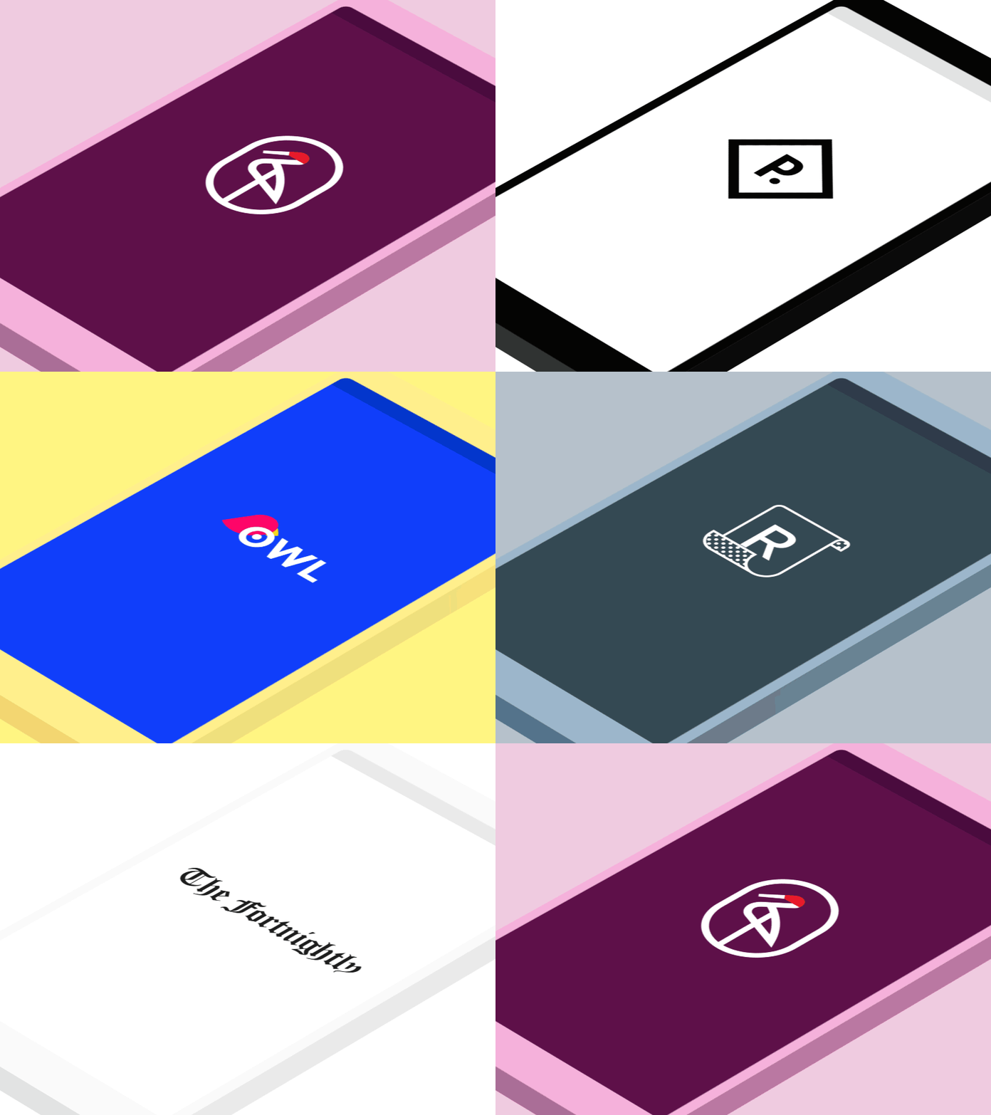
Launching an app for the first time is a great opportunity to highlight branding through motion. It was fun to explore how motion could express the brand of each Material study. In addition to animated logos, the way a UI builds after launch helps set the tone for the app. For example, Owl's energetic brand is conveyed in motion by using emphasized stagger and overshoot. In contrast, Fortnightly's subtle brand calls for short durations with no overshoot and minimal stagger. Read more about how to theme your app using motion here. All credit to Material's visual design team for creating these amazing studies!
More by Google View profile
Like
