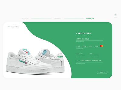
Daily UI #002 - Credit Card Checkout
Hey dribbble!
Second day on the #DailyUI #100dayschallenge and it's time for a credit card checkout.
I find annoying when I'm paying for something and can't see what stage of the process I'm at, and also, not having a way to come back.
So I made sure to have a process bar on the top, a "backward" button and a "cancel" button for indecisive people like me.
Let me know your thoughts!
More by Jenny De Jesus View profile
Like
