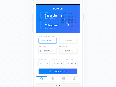
Home screen. FlixBus redesign concept.
Home screen of my FlixBus redesign concept.
I came up with the idea to show previously entered locations on a map, so there’s a clear and visible feedback after user’s input. The button on the left allows to swap the order of the two destinations and elements like date picker or selecting number of travelers allow users to customize their search.
Main CTA on the bottom of the screen is visually distinct, with intuitive search icon explaining the type of action you’re about to perform.
More by Bartek Gadzina View profile
Like
