Pixar *redesign*
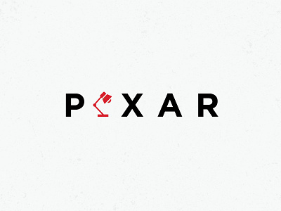
Got some free time to create the redesign of the Pixar logo.
I refreshed typography by making it minimal style and editing the letter spacing for easy reading on surfaces of any size.
Added a simple and clear icon, symbolizing their brand.
Added a corporate color that they can use for various purposes in branding.
Write how you think: Сould they use such a redesign in real life?
