NGO Site redesign
Armman - NGO website re-design
This was one of the side projects I had worked on sometime back.
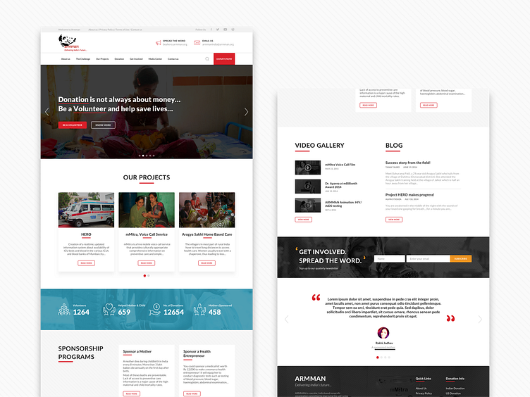
The requirement was that the site was developed a long time back and hence had quite an old school design. The information could not be easily understood. There was no emphasis on Volunteering and very less on Donation. On the whole, they wanted the site to be more in line with the current standards and more emphasis on help people could provide that land on their website.
Keeping this in mind, I came up with the above design. This was just the first draft an earlier stage in designing, thought I'd share it here. First thing I thought that can help the users landing on this site is the information load. Earlier the first fold had a lot of information on the different projects the NGO worked. I tried to space this out, introduced banners that can speak about volunteering/donation, and quick links for the same. Another important thing I introduced was the counter in the center of the web page. It shows the number of Volunteers, Mothers & Children helped and other important stats. This helps in building confidence in the user's perceptive as they see visual proof of the work done, the donations received, this will make them more open to volunteer/donate. A Testimonial section also adds to this confidence when real people speak about their experiences towards an NGO, Product, this helps build confidence in the user and they tend to feel safer.
Some of the icons used have been downloaded from The Noun Project and have been modified. Some images used belong to Armman, the NGO and some others are taken from Google. They have been used just for representation purposes. The actual site will only have images that the NGO has copyrights of.
-------------------------------------------------------------------------------
Do Share your feedback and show some love.
Thanks
