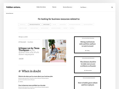
Hidden Onions — Resource Page
Hey guys,
More concepts from this project. This is the resource page. Check out the attachment for full details. Not the most interesting page from an aesthetic point of view. But it's one of the most important pages. For the objective of the page - less is more in this case. Let users get the information they want without having to be overloaded with unnecessary ornamentation.
Images are placeholders for now and are copyright of their respective owners.
More details and shots coming soon
-
-
Learn UI/UX with my design class - Process Masterclass
Learn UX design in depth my class UX Masterclass
Join Verse my weekly newsletter where I share insights about design, entrepreneurship, happiness and my overall journey. (I'm doing a big revamp next year so jump on!)

