Big Enough 404 page
Howdy, fellas? So I made a little research and there is 3 key elements to any 404 error form:
1) Make it soft for user. 404 is like a punch in a face by internet when user expects to get a sweet cake. So 404 page should explain user softly what's happen, instead of sсreaming at him;
2) Humor. The best way to soften the situation.
3) Way out. We should left user a way out of 404 page - home button for example, so he won't left. Especially if it's first user's touch with the website.
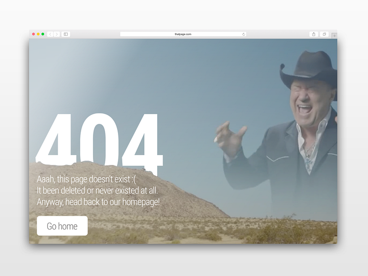
So I connected all 3 elements and that's how this creature was born!
Well, why not? At least it doesn't look like the rest of Dribbble's "illustration+text+button" shots
