Nicholson Logo Process
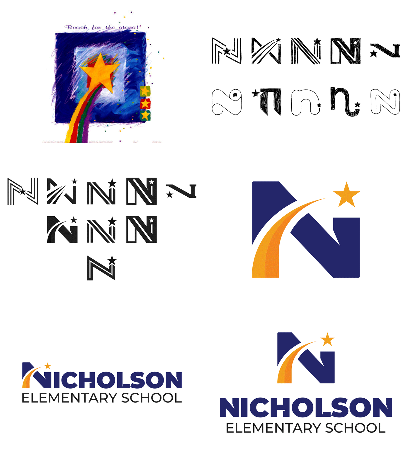
This is another identity refresh I just finished for a local elementary school. They were using a picture of a shooting star painting as their primary logo and were in desperate need for help.
As you can see, I provided them with 10 sketches based on the letter N and the shooting star concept. They picked their top 5 which I refined digitally (some had a few variations). From there they picked their favorite and I added color and a custom type treatment to finish off their visual identity. This was a really fun project and I look forward to showing the complete brand package in the near future!
As always, let me know your thoughts!
More by Randall Dunson View profile
Like
