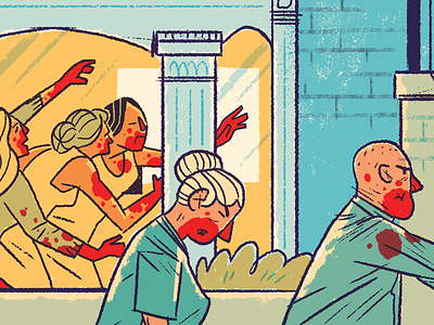
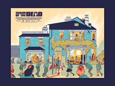
Shaun of the Dead Detail
I had posted a shot of the poster in total, but it's pretty hard to see the details at a Dribbble scale, so I thought I'd do a second posting that highlights what is actually going on up close with the texture and colors.
I wanted to create a very retro playful vibe with the line work. And let the colors look almost faded. I hope you enjoy!
More by Clade Design View profile
Like

