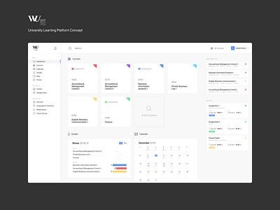
Learn@WU - UI Monday #2
Another week another UI Monday!
This time I decided to give my university's online learning platform, something I use daily, a little facelift.
Hit the link below to compare it to what the platform looks like at the moment: https://www.dropbox.com/s/kjhmc1hoo6wvlj0/Comparison.png?dl=0
I thought it would be cool to organise and label courses with colors across the entire platform for easy identification. Every kind of feedback would be greatly appreciated guys.
Have a great week everybody!
More by Daniel Putzer View profile
Like

