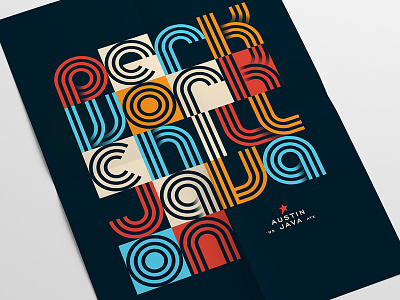
Java On Poster
We're wrapping up a rebrand for one of Austin's beloved cafe chains, Austin Java. This project represented one of our best and closest collaborations to date. Our designers created three distinctly different brand directions, this being one of the killed directions. I'm still very happy with how this concept balanced the client's vision to make something retro AND modern, Austin-y, and sufficiently upscale. Lot to balance, but I was happy with the outcome.
Follow Tilted, it's worth it.
Instagram | Facebook | Twitter
More by Tilted Chair View profile
Like


