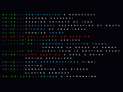
"No readability required" - IPDB hackathon program
In the hackday slide deck I was about to present to the team and co-organisers there was only one slide that was hard to reasonably defeat as a concept - program slide - and I got emotionally prepared to hear: "That's unreadable!" Because it is.
There were more composition-nailed options for the program in the WIP file, but my gut feeling pushed me to the that simplest and yet less readable single-block.
I was ready to agree on a less radical option, if team says "#no". But my team... after staring into the layout silently, suddenly shouted: "Ouuu... We love it! It it weird! But we love it!"
In this case they were not only my dev team, but also a target audience. If target audience feels the design, it is the right design. Even if design principles "died" here.
My "weird" program layout got through selection to the final hackday slide deck :)
