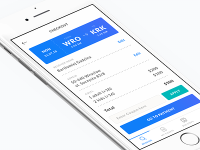
Checkout screen.
My goal was to allow transparent review of all details before you go to the payment screen.
This view uses clear labels to guide user through the form, with billing information fully editable and easy to update. There is also an option section to enter coupon, with Apply button that doesn’t distract from the main CTA.
More by Bartek Gadzina View profile
Like
