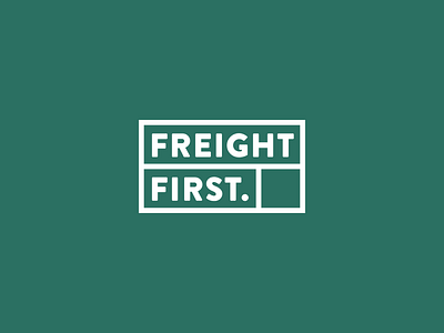
30 Day Logo Challenge IV - Freight First
Just as I struggled with the design for day three, I was on the right path for day four in seconds. The brief is for ‘Freight First’, an intermediary freight broker between shippers and trucking companies. The logo had to be solid, trustworthy and showcase the safe and secure ways the company is handling cargo. 🚛
From the brief: “We’re not looking for a logo that is eye-catching or even colorful. It just has to convey the company’s industry experience and professional services.”
Living in the city with the biggest harbor of Europe, Rotterdam, I’m fascinated by containers and how sometimes walls of them float by on massive ships. I decided to work with a solid shape to represent containers and fit the blocks together like a puzzle. I’ve been playing with arranging the forms in different ways, which will give the company a lot of freedom when implementing the brand.
Look forward to day five!
