Redesign Concept for KAI E-Ticket
This is my redesign concept for KAI E-Ticket.
I want to explore what are the possibility that available for the E-Ticket design of KAI that can improve the user experience of the user / customer.
Here, I am trying to bring the physical ticket experience to the digital mode.
People are using physical ticket for a long time. They used to bring their ticket to the train station, airport, etc. But since the existence of the smartphone, people's habits changed. Now, we can do almost everything by smartphone and the internet. Which is including people buy their ticket.
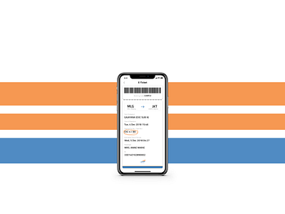
I want to make people feel used to their E-Ticket because it has similarity with their old physical ticket. In the physical ticket the operator usually will highlight or scribble the important information in the ticket to tell us where is our seating or which gate that we should wait for our transportation, and etc.
This is common thing that we usually experience when we are finish check in or boarding.
This is one of my reason why I bring the scribble for highlight in the E-Ticket, because people are used to it. So, it can make people / user feel like they have seen this such ticket format in their previous memories. Also the scribble is make the user easy to notice the important information of the ticket.
And also I make the bar code fixed in the top of the screen so the user doesn't have to scroll their screen when they have to scan it.
For the colour composition, I'm using the KAI logo colour as a references.
Would love to hear your feedback!
Yours Truly,
R.
