Levels Of Trust
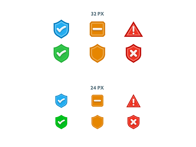
Two sizes of different variations of icons demonstrating 3 levels of trust for a news app:
(Left to right):
1. Highly Trusted
2. Partially Trusted
3. Not Trusted
Wanted to have selective depth on these and experimented with different stroke widths for different sizes. Additionally, there was a good amount of discussion around differentiating the levels of trust with/without distinct outer shapes or just the symbol inside of the icons.
Between the top and bottom rows of each sized section, do you have a preference? Would love to hear your thoughts in the comments!
![Max Burnside [Available for projects]](https://cdn.dribbble.com/users/303299/avatars/normal/5380070fabf4894e68c5de6113f868b0.png?1690152453)