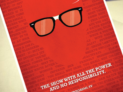
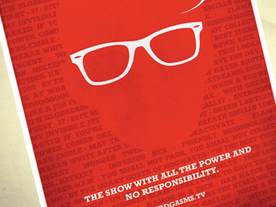
Teaser Poster Revision
This feels a lot better to me. I think all the white made the previous version too bland. Now it reads better with three points where viewers eyes will go.
More by Dennis Salvatier - tanoshiboy View profile
Like


