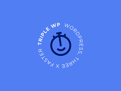
30 Day Logo Challenge III - Triple WP
To be honest I struggled quite a bit with the third brief for the Thirty Day Logo Challenge. 'Triple WP' is an application for Wordpress, helping developers create a Wordpress site three times as fast. It should be "friendly, not intimidating and incorporates a typeface that reflects their cutting-edge tech", including a color palette of blue, white and black.
First thought? 😴
My first sketches were all really boring, working with the three w's and making symbols that only looked cool once I ditched the concept and just started designing things. So I took another day, and drew this. I like how it turned out! The icon is a friendly stopwatch that can be used as a small icon too (easy for the Wordpress toolbar!) and the purple-ish blue makes it a little bit less business-ey. Hope for an easier ride tomorrow! 😅

