Amazon /// New & Simple Redesign
UI-A-DAY // Day 3 //
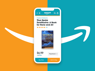
This is a concept for Amazon's mobile app. I do not work for, nor am I associated with, Amazon. There's no real need for Amazon to redesign their app, I trust it's doing more than okay as is. I just did this concept redesign to simplify Amazon's existing UI.
The header looks very similar to the existing header, though it is redesigned from scratch. It was difficult trying to simplify Amazon's app though, because Amazon is the largest, most diverse market in the world – their app needs to do a lot and provide a lot of information for a diverse spectrum of users. In their app now, just on a screen showing a book, they have long ISBN numbers, they have a lot of wordy text describing shipping opportunities, and there's greens and bright blues and greys on the page in addition to their 2-3 core brand colors. With this redesign, I only used their brand colors and only one grey to create the drop-down box where user's choose the book format. Other than that, it's really two colors and one font, that's it.
I appreciate feedback! Bitter and praise, give it all to me.
Peace Dribbble.
