Vote for Consistency
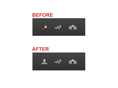
Since the website is very "avatar" directed, I thought was unnecessary, and a bit inconsistent the way the new navigation is currently. If you travel through the inspiration, users will see the avatar for sure, but within the nav area I think would be nice to keep consistent iconography.
Currently you have this happening: http://cl.ly/2t0u3e2O0A2L371r1D3b but the avatar seems blurry and might not add much value at that size. I would suggest this: http://cl.ly/3X1345382A3R1x2F1Z1t
Thank you Dribbble, for being an awesome site!
If you like this idea - share it!
More by Dell View profile
Like
