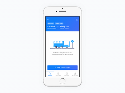
Results screen.
I put all connection details in the header so user can access it all time and potentially edit or correct the information.
The illustration provides approachable way to display an error and helps user to make another step - finding new connection is just one tap away. I tried to make this experience as pleasant as possible and offer alternative action using a visible CTA so the users don’t get stuck in the booking flow.
@Razvan Vezeteu Thanks for letting me using your illustration!
More by Bartek Gadzina View profile
Like
