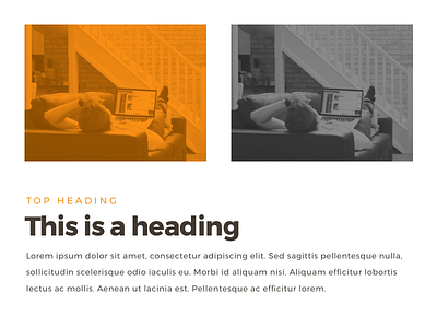
New Nextap corporate identity - Images and typography
Part 2 of our new CI (don't forget to check part 1). This shot is focused on our visuals and typography, which has been overlooked so far in the previous CI.
Don't forget to leave a like (press “L”) ❤️.
We would like to hear your feedback as well 💬.
More by nextap ux View profile
Like
