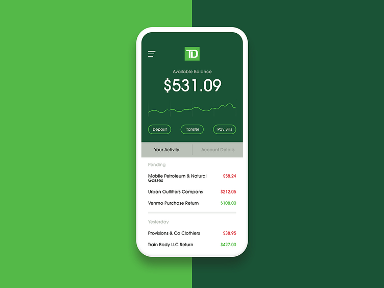
TD Bank // UI Concept // They Need An Update
UI-A-DAY // Day 2 // This is a UI concept for TD Bank. I do not work with or for TD Bank, but I am a customer, and their app sucks.
I use the TD Bank app every day to check my balance and see what transactions are coming through. The app is slow, there's too many taps to get what you're looking for, and the UI is pretty outdated. It does what it's supposed to, but for "America's most convenient bank" I think they can put a few dollars into making their mobile app more...convenient.
I didn't add any new functionality besides the line-graph under your Available Balance. I brought this in to the app because of Robinhood. I love looking at my progress over time on Robinhood's home screen. It gives you perspective and, of course, satisfaction when your graph is sloping upward (you're making money). I brought the line graph into this UI concept so bankers can see their funds over four quarters of the fiscal year.
Please squirt some feedback on me if you have any critiques! Peace.
