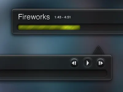
Music App Element Improved
Here are some improvements to my previous post yesterday: Added long highlight underneath the progress bar container, a pushed down view for the buttons, and I was trying to figure out a way to display the time of the song.
Also, here is a full resolution view: http://cl.ly/2S6R (Thanks for all the critique :D)
Chirpin' http://www.twitter.com/Mazalthan
More by Jonathan Mazaltov View profile
Like

