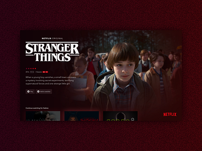
TV App – Daily UI #025
For Daily UI #25 the task was to design a TV app. I went for pretty much the only TV app I use: Netflix. The end result looks quite similar to Apple TV's Netflix app. I wasn't really trying to imitate it, but that's how it ended up :)
Although I find that Netflix's interface is lacking in many aspects, the preview/highlight mode is one of the things that looks and works quite well as it is. Maybe that's why I didn't end up making any major changes. Instead I focused on enriching Netflix's identity by adding new hues of red/bordeaux/brown/black, rather than just the red/black theme they had going on before. I've also added discrete gradients and glows (in the star rating for instance) and other details just to create a more entrancing effect. I think small details like this make all the difference.
Thoughts? :D

