Holyweek Programsmockup Port
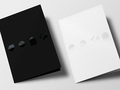
During the creative process for the 2018 Easter event, I proposed the the title "Open," as it appeared in several of the main lesson ideas and biblical stories that were the focus of the Easter services. The main themes of the messages were about spiritual blindness turning to sight and stubbornness to faith, based on seeing the not immediately obvious. And of course, the literal act of opening, such as the tomb and the hole in the roof were easy targets as well. For the design, I wanted to try to use negative space to make the title less obvious, so that it required more attentive visualization. Thus, the shapes that make up the title are simply the interior spaces of each letterform. After I had finished Open, it occurred to me that the symbols in the word Done (as in, "it is finished," are the same shapes as in Open, just rearranged. I proposed using Done for the Good Friday services, and prepared each design in monochrome with a spot gloss to create a visually arresting and emotional journey from death to resurrection, as in the biblical story.