Study App Marketing/Landing Page
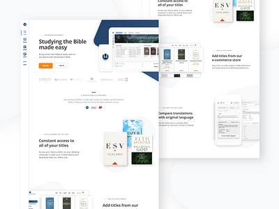
A marketing page I made for a Bible study app. They wanted to communicate a message of ease of use, professionalism, and of product value.
I decided to use a contemporary look of white space and soft shapes to communicate a welcoming feeling and lack of complexity to the user, many of whom are college students.
More by Ben Mills View profile
Like
