Interreg Slovakia-Hungary, European Regional Development Fund
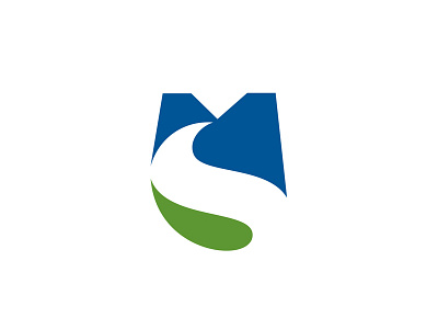
"The capital “M” which appears in the upper part of the shape forms hills, mountains and castle, the “S” as a projection of the “M” in the bottom, is a metaphor for a river and road.
The “blue” color indicates the Slovak Republic, while the “green” color indicates Hungary (Magyarország)."
Logo design for Slovakia-Hungary cross-border cooperation, Slovakia-Hungary.
SKHU (S+M) character logo = SK (S)lovakia + HU Hungary=(M)agyarország
Interreg was developed as a Community Initiative in with a budget of just 1 billion EUR covering exclusively cross-border cooperation in 1990. Later, Interreg has been extended to transnational and interregional cooperation. For 2014-2020 European Territorial Cooperation is one of the two goals of Cohesion Policy besidesinvestment for Growth and Job. Over the years Interreg has become the key instrument of the European Union to support cooperation between partners across borders.
The aim: to tackle common challenges together and find shared solutions - whether in the field of health, research and education, transport or sustainable energy. Interreg programmes are funded by the European Regional Development Fund to support the harmonious development of the European Union's territory at different levels.
The logotype symbolises the connection, through the common geographical parts of the participating countries. The shape was formed from the capital starting letters of the country names in their original languages - “Magyarország” and “Slovak Republic”.
The capital “M” which appears in the upper part of the shape forms hills, mountains and castle, the “S” as a projection of the “M” in the bottom, is a metaphor for a river and road.
The “blue” color indicates the Slovak Republic, while the “green” color indicates Hungary (Magyarország).
