Dribbble: the community for graphic design
Shots
Shots
Designers
Explore
Popular
New and Noteworthy
Product Design
Web Design
Animation
Branding
Illustration
Mobile
Typography
Print
Hire a Designer
Browse Designers
Post a Job
Submit a Brief
Hiring on Dribbble
Find Jobs
Blog
Sign up
Log in
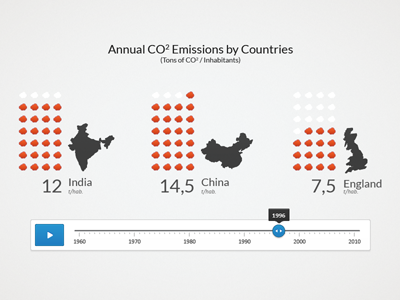
Pictogram Chart of Countries CO2 Emissions
Bertrand Ventadour
Follow
Following
Like
Get in touch
#F2F2F2
#A0A1A1
#3F4040
#D5A7A8
#D94E29
#5C5D5D
#2D87C1
Download color palette
Another research of how to make data more expressive and legible.
Bertrand Ventadour
Get in touch
More by Bertrand Ventadour
View profile
Previous
Next
Loading…