K&C rebranding
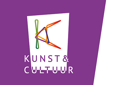
K&C’s new logo is composed of the letters K and C. Its intertwining aspect symbolises the connection and cooperation between and with K&C’s different target audiences. Its abstractness expresses boldness, while the round shapes ensure a friendly appearance. The use of bold colours emphasizes the company’s creativity, and the use of gradients accentuates diversity. The result is a strong logo that appeals to a wide audience. Let us know what you think!
More by Publiek View profile
Like

