Foundry 301
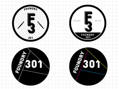
A sprinkling of some logo ideas for a design club called Foundry 301. I'm leaning towards the bottom one, the color exploration would use CMYK for line weights to reference print design. I wanted to use geometric, blocky, sans serif to keep it clean and modern... thoughts? suggestions?
More by Kirsten Ahrendt View profile
Like
