Do Don'T - A Good Register

Hope you like it! Press "L" on your keyboard and follow me to not miss upcoming advice. I m tired of a bad registration experience.
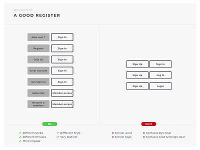
Often you can see two button of registration : « sign up » & « sing in » or « sign up » & « Log in » But for me, it’s the wrong way!
Why? English is not my first language, I m « foreign user » and when I want use a new platform I always stop my action and think before if I do click on « Sign In » or « Sign Up ».
It’s the same issue for the dyslexia people. Because the word used it’s too similar and geometric by the prepositions. This can cause confusion and mistake.
That is why you need to use different word and by the ‘UX wording’ you can increase social engagement. Don’t make waste the time any longueur for your users. Contrast your button to help users. It’s important for users to find the button to registrate quickly when they first visit your site, or it’s gone and you miss one.
What do you think about that ? Share your best or worst experience in a comment below.
⚠️
I am starting a TikTok page where you can follow my design diary/hacks.
I will also hunt bad UX! Do not hesitate to tag me (@do.don't.ux) if you find bad UX! 🎉