Abstract Letter C
The triangles of the first version lacked meaning, so...
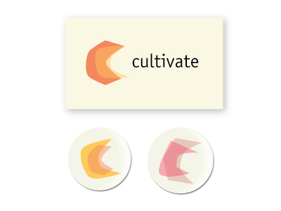
– Made it the letter "C" from the word Cultivate – Added opacity to empashis the synthesis of the two forms – Tried it on buttons and the front of a business card
The logo is never the same, but it uses the same color scheme and the same style to represent the coming together of different ideas and people along with how we always are changing and growing.