Dubolt Mobile Optimization
Made a few long awaited updates to Dubolt to make it easier to use on the go.
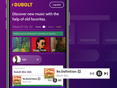
Now, on smaller resolutions, the player is replaced with a new smaller mobile friendly player that remains fixed to the bottom of the viewport.
Also new, on mobile the seeds you've selected and artists/tracks you've listened to recently now have a horizontal scroll that extends to the edge of the screen. This was done to prevent the entire area of the site above the fold from being completely taken over by seeds and recommendation and to help you get about the business of finding music to listen to.
There are other smaller tweaks in the design as well. The track text is smaller now in mobile, as is track artwork. The explicit track label now ditches the filled background for a transparent one and a defined border.
As always, the project can be seen at https://dubolt.com, and I'd love to hear any feedback or requests you might have
