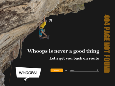
404 Page not found - DailyUI revised
My first attempt at a '404 page not found dailyui' had a lot of "white" space. But whitespace isn't about it being "white", but can be other colors, textures, and photos. And what's more important is how you deal with the space given to provide clarity for the users. I also wanted to try a few different ideas with the original. Inverting the colors of much of the text and backdrop color. I also incorporated Comic Sans, and a different Speech Bubble to loosen up the tension I was feeling in the page. I'm debating whether to animate it through Principle or not. Let me know what you think.
More by Matt Weaver View profile
Like

