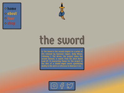
The Sword Website UI Idea
After making my previous website UI on Andy Mineo's EP "I: The Arrow," I thought that I would do a website UI based on his second EP "The Sword." I REALLY think that it turned out well with the font, the gradient, and the layout.
Hope y'all like it! God Bless!
links and stuff:
-the navbar font is "Germania One" (https://fonts.google.com/specimen/Germania+One)
-the social media icons are from flaticon.com
More by Jonathan Bruce View profile
Like
